6 Best Paint Colors To Lighten A Dark Kitchen, According To Ryan Creative Living
A dark kitchen may look good and cosy but if you want a brighter cooking space or looking for ways to lighten, one of the best ways to make a difference is using paint colours. With the right colours, you can create a fresh and inviting cooking space.
Ryan Creative Living-the best interior designers offer expert guidance on 6 best paint colours to lighten your dark kitchen. These best paint colours will help elevate your space, and increase functionality and aesthetics.
From the softest pastels to the most vivid colours, each colour that you pick has its own unique character and mood’ ensuring your kitchen becomes warm, welcoming and functional. Exploring the world of colour we will see how a little makeover can make an immense difference in your cooking space.
Understanding the Impact of Color in Design
Colour is one of the most important elements in interior design. It can make people feel a certain way and also change how a space looks. In a dark kitchen, the right color can make the room feel brighter, friendlier, and bigger. Understanding how a room colour performs will be crucial in ensuring an artistic yet functional home.
Colors can evoke multiple emotions and actions. Warm colours, like yellow and orange, form a sunny and energetic effect and hence motivate people to interact and create new things in the kitchen. But cool colors that are blue and green, promote calmness and the kitchen becomes a good place to chill out after a hard day.
Best Paint Colour To Lighten Your Kitchen
-
Soft White
To bring light to a dark kitchen, choosing the right paint colour is one of the key steps. Ryan Creative Living suggests using soft white. The colour is highly reflective of light hence, the kitchen feels open and clean. Also, it increases the feeling of roominess and hospitality.
Soft white blends well with several design styles which include both traditional and modern. It gives a variable base for popping décor, appliances, or cabinets.
-
Creamy Beige
Ryan Creative Living recommends you choose creamy beige if you want your kitchen to be a little more sophisticated. This colour not only reflects the light but also creates a cosy and attractive atmosphere. Creamy beige is also a versatile background, which allows you to play with the colours of your décor and furniture without any hurdles.
It harmonizes the most different kitchen styles, from modern to classic. The cosiness of this tone complements natural lighting, thus, the place will be light and open. The inclusion of creamy beige into your kitchen might make it one of the pleasant and bright corners to cook and enjoy some company.
-
Pale Gray
Ryan Creative Living recommends the use of pale grey in kitchens. This light colour is reflective and compatible with a variety of styles and decor pieces. The light gray in combination with the proper kitchen layout and fixtures will produce a more spacious and bright look.
It is compatible with a variety of decors such as modern and classic. Adding pale grey to the kitchen might make it look new and fresh but also it is a more comfortable place to be in.
-
Warm Taupe
A good paint colour you might like considering is warm taupe. That is a colour with a mellow feeling that lightens up any space. This neutral color in turn brings out style in several cabinets and countertops, the result of this being an aesthetic kitchen.
Warm taupe connects your kitchen with the surrounding space, making it suitable for open layouts. It is compatible with both modern and traditional designs, thus maintaining a coordinated and elegant kitchen.
-
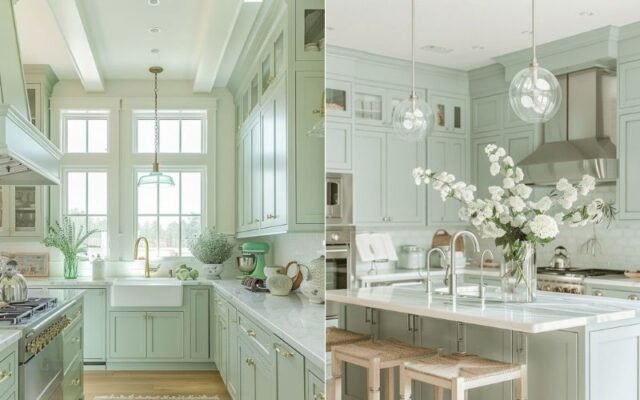
Pale Mint Green
Ryan Creative Living recommends the pale mint green for kitchen improvement. This peaceful hue reflects the light well, hence, no longer making the place stuffy and congested. The light mint has the privilege of being versatile in that it can be added to kitchens of varying styles, from contemporary to traditional, and it furthermore mixes well with both dark and light cabinetry.
Along with adding pale mint green to your kitchen which increases brightness, it also gives the feeling of personality and charm, therefore, it is a more enjoyable place to cook in and to come together for the family.
-
Soft Yellow
Ryan Creative Living suggests a soft yellow as the best option to consider. This cheerful shade, besides bringing in more light through the reflection, also creates a cosy and welcoming ambience. Light yellow brings happiness and comfort to a family room where they can spend quality time and eat meals.
Besides, it goes hand-in-hand with many kitchen styles, ranging from modern to rustic, hence it is applicable in design as well. Including a soft yellow colour in your kitchen will help to create a more spacious and airy look while bringing a hint of warmth and joy to the environment.
FAQs
A. Choose light colors like soft white, pale gray, or creamy beige that reflect light and make the space feel larger.
A. Bold colors can make a dark kitchen feel smaller. Instead, go for lighter shades of bold colors, like soft mint green or warm taupe, to add personality while keeping the space bright.
A. Warm light colors like creamy beige or soft yellow add brightness without feeling cold. Combine them with natural wood finishes and warm metallic accents to maintain a cozy vibe.


